Whether you’re selling your own products or doing affiliate marketing, a well-designed landing page will help increase your revenue. This is because landing pages are a critical part of gathering leads for your business.
The right landing page is one of your business’s most valuable online assets. While the median conversion rate is somewhere around 3 to 5.5%, a page with millions of views will earn a significant amount.
If the design and copy are done right, the conversion rate rises even further to 11.45% or higher.
What makes a good landing page? Today, we’ll share some of the secrets of successful companies, who have used landing pages to grow their customer bases.
- Keep the Headline Short and Simple
- Add Clear, Relevant Images
- Consider your Visitors when Writing Copy
- Choose Clarity Above All
- Emphasize the Benefits for your Visitors
- Display Testimonials and Reviews
- Add Trust Badges and Publication Logos
- Make your Call-to-Action Button Stand Out
- Offer a Way for Visitors to Contact You
- Keep Improving your Page
1. Keep the Headline Short and Simple
When you write a headline, it’s best to keep it short. Anything more than 20 words is too much. The headline should point out a specific benefit or an identifying trait of the ideal customer, or appeal to the visitor’s emotions.
On the other hand, subheadings should be used to provide more details about the product or service you offer.
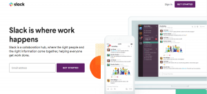
For example, Slack’s landing page headline simply says “Slack is where work happens”. This is followed by a description of the product. The description itself offers an ideal situation where the product is used to help high-performing teams collaborate.
Slack is the perfect example to follow, as they boast 100 million website visits monthly that result in free-to-paid conversions of around 30%.
2. Add Clear, Relevant Images
Images help site visitors visualize what they could expect from your product. They satiate the visitor’s curiosity about how the product will look and how they could expect to use it.
Let’s stick with the same example for a moment.
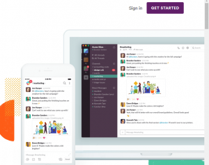
When you move your eyes to the right side of Slack’s landing page, you see examples of the product being used. You immediately see that Slack has both a desktop and a mobile version, without it being stated. This is great visual storytelling.
Because you could see the same messages in both versions, you realize that the desktop and mobile versions complement each other very well.
It also pays to have the right kind of product screenshot. The sample that Slack uses shows users actually collaborating on a project. In this case, they are working together and giving feedback on an image.
The image shows that Slack allows its users to collaborate in real-time through its chat feature. Again, this doesn’t have to be spelled out verbally.
3. Consider your Visitors when Writing Copy
The best copy has a conversational tone and focuses on the visitor’s needs and concerns, instead of making the product the star of the show.
As well as emphasizing the benefits on offer, the best landing page copy is concise and straight to the point. The goal is to get users to the CTA as quickly as possible, so there’s no point in waffling.
Check out this short piece of copy from Graze.
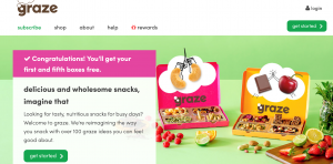
The body text starts with a rhetorical question. This is an easy way to project to viewers that you understand the problems they face, and that your product is the right one to solve them.
4. Choose Clarity Above All
Jargon hardly impresses anyone anymore. While you could drone on and on about how your “cloud-based application” is a “disruptor” in the “tech space”, it ultimately does nothing for your brand.
In fact, some people might find it inaccessible, even pretentious — two descriptions you’d rather not hear about your business.
Instead, choose clarity.
Use simple descriptions that go straight to the point and help the visitor understand what you have to offer right then and there. If your visitor has to open the dictionary or opens another browser window to Google your word choices, you’ve already lost their engagement.
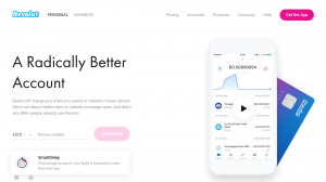
FinTech companies are often the worst offenders, but check out how Revolut present themselves in landing pages:
There’s no mention of how their service works at a technical level. Instead, they set out the features that make them different from traditional banking.
5.Emphasize the Benefits for your Visitors
Like you, your site’s visitors are thinking, “OK, these features are nice and all, but how exactly are they going to help me?” To get around this, it’s good practice to focus on the concrete benefits of your product or service.
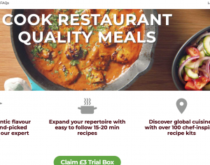
Simply Cook are masters of this.
Notice that this landing page barely contains any information about the service at all. That is, you can’t see how much it costs, or how often you’ll receive your food. Instead, the headline grabs your attention by clearly stating their USP.
Then there are three short pieces of copy, each of which sets out a different benefit of the service. Notice as well that each of these are written in the imperative case, which is just that little bit more compelling.
6.Display Testimonials and Reviews
A website without reviews feels sterile. It doesn’t inspire or make anyone feel like they’re looking at a page designed for and by humans.
Reviews, by contrast, give your visitor a glimpse into how the product’s users have benefited from it. It transforms the product into an experience. It stops being just something to download and becomes something that works for people just like you.
A review places the visitor in the shoes of the reviewer. It gives the visitor an idea of the user journey and how they can expect the product to treat them.
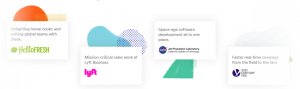
Some companies can get away with also displaying the logos of the organizations that use their product.
If you’re a visitor, seeing that Slack is used by the likes of Lyft, 20th Century Fox, and NASA gives your confidence in the product. It could also be a selling point to both your clients and potential users, just in case you encounter initial resistance to the product.
After all, if it’s good enough for NASA’s Jet Propulsion Laboratory, it should be good enough for your project team.
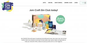
7. Add Trust Badges and Publication Logos
Trust badges and publication logos are very helpful when it comes to conversions, especially if you’re running an e-commerce site that accepts credit card payments.
Studies show that about 15% of online shopping transactions get abandoned because of security concerns.
However, an SSL badge from a provider like VeriSign helps assure customers that their transaction is secure. Then they can be confident that their credit card details and personal information won’t be stolen or misused.
A badge from the Better Business Bureau, on the other hand, ensures that a company conducts legitimate business and does not scam its customers or employees.
A publication logo, especially one coming from a reputable national publication, is a sign that your product has made it. That is, a publication found enough potential or interest in your product to feature it in their website or print version.
Craft Gin Club boasts about being featured in both Marie Claire and GQ Magazine.
8. Make your Call-to-Action Button Stand Out
Finally, you’ve reached the point where you are confident enough to ask people to try out your product. How do you ensure that they click on your call-to-action button?
Your button should stand out and be seen easily. In terms of visibility, bright colors like red attract more clicks than subdued colors like green. However, red buttons aren’t necessary. The color of your call-to-action button should still be consistent with your branding guidelines.
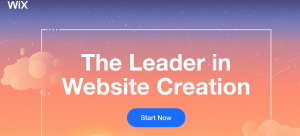
In the example above, Wix doesn’t take any chance, placing an enormous blue CTA on their orange background.
If you have a long landing page, it’s also a good idea to repeat the call-to-action button. In fact, the most successful landing pages use this format. The basic formula is to make a pitch to your viewers, followed by a CTA. This can then be repeated up to five times.
The copy on the button is just as important as the rest of the landing page. Wix uses action words and avoids generic ones like “Inquire” or “Submit”. Its choice, Start Now, is short, simple, and powerful.
9. Offer a Way for Visitors to Contact You
Of course, your visitors will not always be signing up on the first visit. Sometimes, they need more information before deciding to buy or start a free trial. This is the best opportunity to bring in your pre-sales or customer service team.
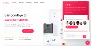
Many businesses put their “Contact Us” either at the top or at the bottom of the page. However, many people don’t like scrolling up or down just to find the link.
A better option is to use a chat-bot widget, like Pleo do above. This allows your users to contact you directly. Where possible, their concerns can be dealt with by automated responses. Otherwise, they’re directed to a member of staff.
10. Keep Improving your Page
Many businesses just publish a landing page without monitoring its performance in terms of conversions. The best performing online businesses keep looking for ways to improve site performance.
Before publishing your landing page, you could use a tool like Optimizely to perform tests on it and to suggest ways to improve conversion rates.
You could also overhaul the appearance of your landing page by using ClickFunnels. It is often considered one of the easiest ways to create professional-looking pages in just minutes.
One ClickFunnels review even says you don’t need coding experience to get the most out of the tool.
You may also host your landing page on Wix and choose from a variety of templates available. However, compared to ClickFunnels and its flat $97 monthly fee, Wix pricing models vary widely according to location, with some options available in certain parts of the U.S.
How to Create High Converting Landing Pages
Every company we’ve looked at uses landing pages to call attention to their products’ strengths and how they respond to customer needs. As a result, they enjoy high conversion rates.
As the first point of contact for your company, the landing page should capture what it means to be a user of your product. It should give prospects a glimpse of the potential benefits of engaging with you.
A well-designed landing page should also end with a call to action that gives visitors an easy way to access your product, opening the door to potential clients and upselling.
Author Profile
- Blogger by Passion | Contributor to many Tech Blogs in the United Kingdom | Fascinated to Write Blogs in Business & Startup Niches |
Latest entries
 Tech Updates18th September 2025Advancing Audio-Visual Systems for Modern Work, Learning, and Public Spaces
 Gaming29th May 2025Are Gaming Laptops Better Than Gaming PCs? A Comprehensive Comparison
 Tech Updates8th May 2025Are Smart Locks the Future?
 Business6th March 2025Edward Thornton: A Notable Figure in the Investment World